How to Check Responsive Web Layout Alignment Without Browser DevTools

Chief Executive Officer
DevTools can lie
Browser DevTools are indispensable for development and debugging, but they have a fatal flaw for final Quality Assurance (QA): they occupy screen real estate. When you open the inspector, the viewport shrinks, often triggering responsive breakpoints or "mobile" styles that might not reflect how a real user sees your site on a standard 1920x1080 resolution.
Furthermore, inspecting an element often highlights its box-model (content, padding, border, and margin), which can actually mask subtle alignment issues or "optical" centering errors. Developers often get caught in a loop of checking if the code is correct (e.g., `justify-content: center`) rather than checking if the rendered result looks correct to the human eye.
To truly audit a layout, you need a tool that exists entirely outside the Document Object Model (DOM). You need a tool that doesn't care about your CSS, but cares deeply about the pixels that eventually reach the user's retina.
The "Floating Straight Edge" method
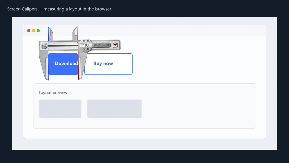
Screen Calipers and Screen Protractor act as physical rulers for your digital screen. They allow you to audit layout without touching the code.
- Verify True Centering: Is that hero image truly centered, or is it optically off-balance? Align the Caliper jaws with the page edges and verify the midpoint manually. This is particularly useful for complex layouts where nested flex-containers might be introducing ghost padding.
- Audit Component Overlap: When elements are designed to stack, bleed, or use negative margins, use the Calipers to measure the exact overlap in pixels. This ensures your "artistic" layout doesn't break into a jumbled mess on specific resolutions.
- Cross-Browser Parity: Open Chrome and Firefox side-by-side. Use the same Caliper instance to verify that both browsers are rendering your flex-gap or grid-gap identically. Often, minor rendering differences between Blink and Gecko engines can cause layout shifts that DevTools might miss.
- Check Optical Balance: Sometimes, mathematically centered text looks wrong because of the character shapes. Use the calipers to find the optical center and adjust your CSS accordingly for a more professional finish.
Testing Breakpoints
Instead of dragging the side of the browser window and watching the "Resolution" badge in DevTools, use Screen Calipers to set a fixed width (e.g., 768px). Then resize your browser until it perfectly matches the Caliper jaws. This gives you a stable, non-intrusive environment to audit mobile and tablet views.
Stop guessing and start measuring.
Download Screen Calipers on the Screen Calipers page .
Try Screen Calipers
Download the free trial for Windows 10 and 11, or buy a license.
